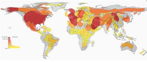
Above is a heat map of the world according to the attention each country gets in the New York Times’ coverage.
This is one of several heat maps developed in a project to indicate the regions that some of the major western media outlets, and the blogosphere, give more attention to.
These maps allow you to grasp several media trends at a glance. First, traditional newspapers are highly selective in their coverage of world news. Looking at the three British dailies, editors favour countries that are bigger and more populous, but also closer to home and better developed. They also give more room to the countries of origin of British immigrants, especially if they are white (look at the size of Australia and New-Zealand). Hardly surprising, but still disheartening, especially when you consider that the only brand that does not advocate objectivity, The Economist, covers the world more equally.
Second, we see that web-only outlets do not offer such a different view of the world. That makes sense, considering the narrowing of the news agenda on the web that was described in the Project for Excellence in Journalism’s latest report. Their lack of resources forces them to contract their scope. Smaller issues are better covered by the blogosphere, which seems unbeatable at providing niche news.
[Source: Observatoire des Medias]
[Via: The Black Iris, Boing Boing]