I just love this…
A great new way to represent percentage-based statistics instead of the traditional pie chart.
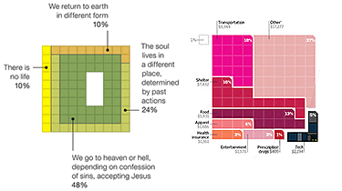
– The chart on the left is from a NY Times story on atheism and the afterlife, and was created by Charles M. Blow.
– On the right, a detail from a Wired story on how much Americans spend on gadgets, and was created by Arno Ghelfi.
Very creative and more representative and accurate I think.
[Via: Anil Dash]
I find that innovative but not very accurate… There is no sorting of the different items. Take for example of the right chart (Annual Consumer Spending), you cannot say easily which part is greater : Transportation (18%) or Shelter (16%)…
Well, visually it might not be clear right away, but the same problem also exists with pie charts, when the percentages are close, it isn’t easy to tell them apart. On the other hand, in these pixel graphs, if you count the pixels, it’s more evident which one has a bigger share.
If you will count to read a chart so there is no more need on them 🙂 In a pie chart you can see which part is bigger without counting, since the items are ordered… so the Transportation part will be close to Other (37%) and the Shelter near Food (13%), Tech (5%), etc.
Well, I see your point, but well even using pixel charts if you organize it better, it can be clearer visually.
The cool thing though is that even without numbers you can get the percentage of each part by counting the pixels; but again if it’s well organized, you don’t even have to do that to know which has a bigger percentage than the other.